Packaging Design
Visual Identity
3D Visuals
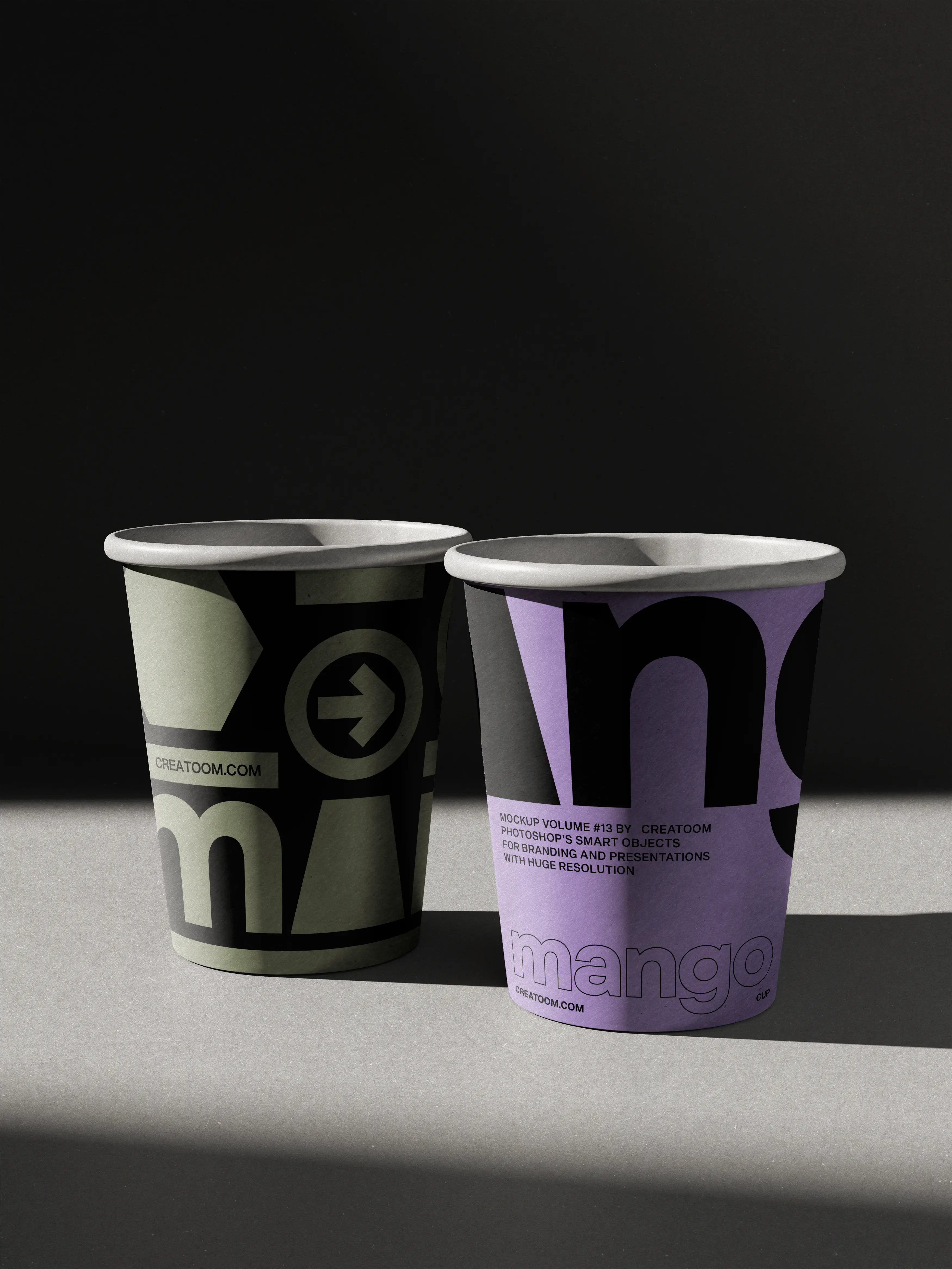
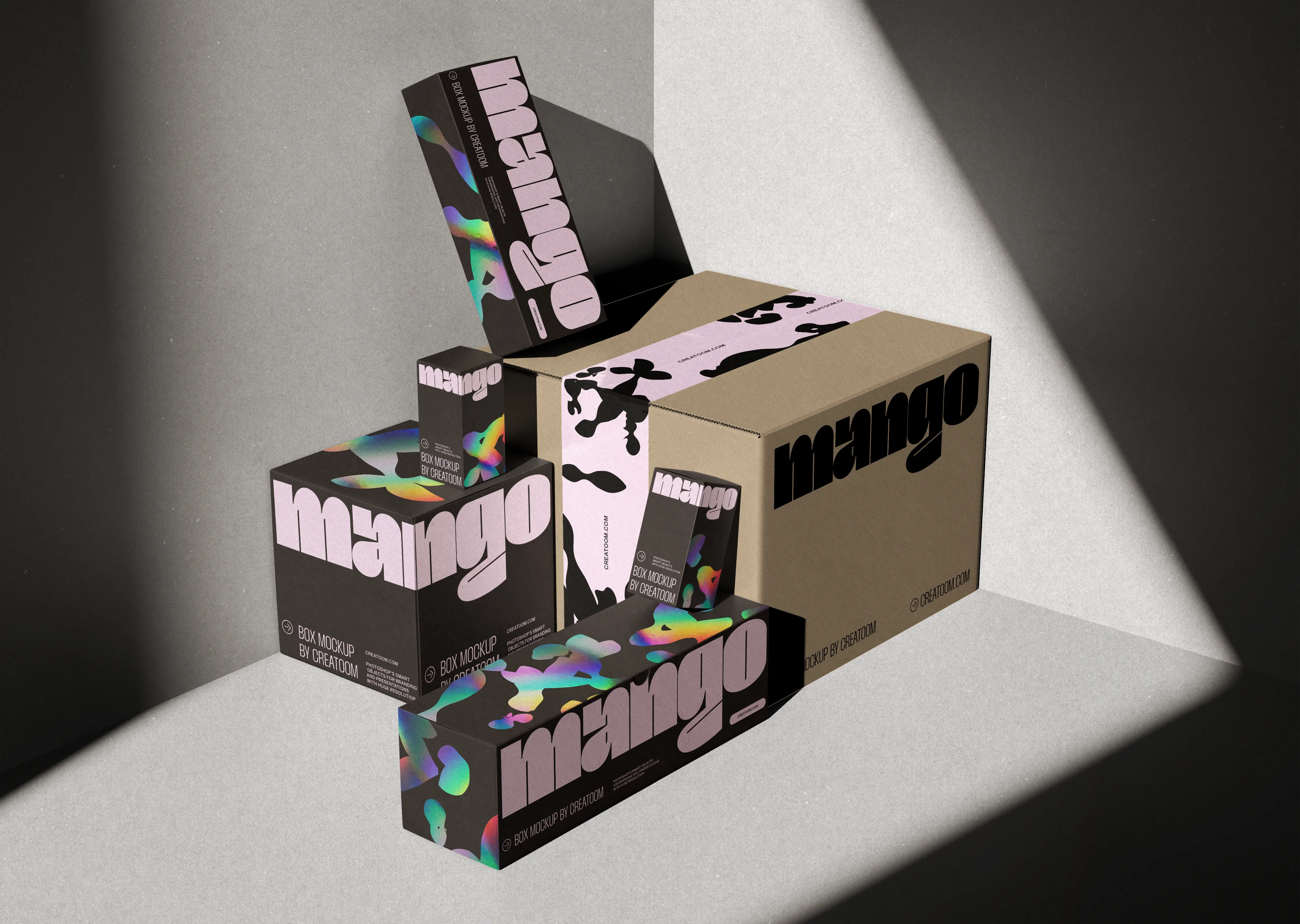
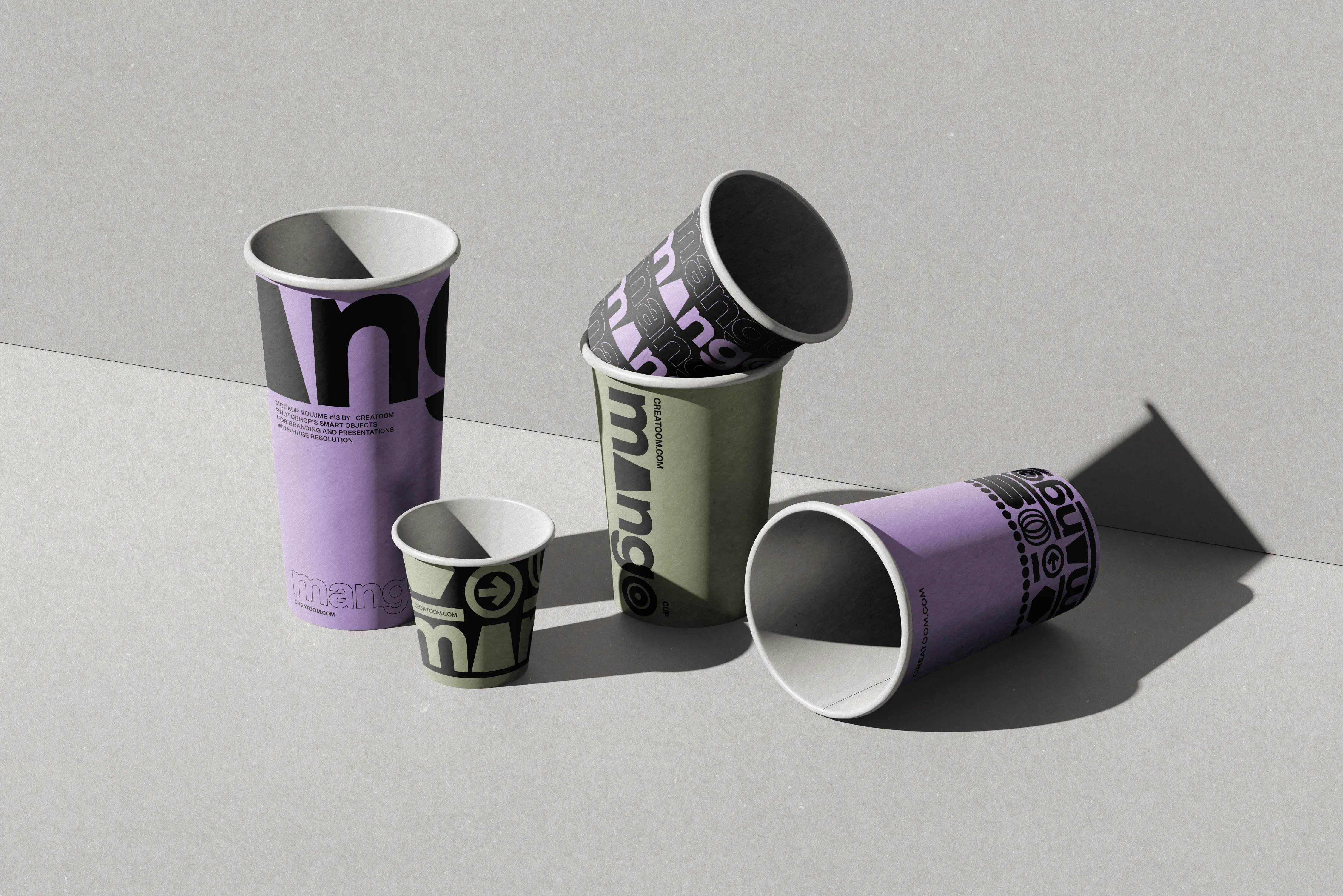
Mango is a juice bar with three counters and a delivery menu. We designed a lowercase wordmark that wraps each cup like a ribbon, and a lilac, olive and black palette that carries across cups, lids and takeaway boxes.

The Challenge
Mango’s cups were plain white with a sticker, and in a delivery bag full of other brands nobody could tell which drink was theirs.
The Solution
We set the wordmark big enough to wrap around the cup, so part of it is always cut off: you see a fragment and still recognise it. Each cup size gets its own base colour, and the same wrap carries over to the takeaway boxes.
Renders of every pack were ready before the first print run, so the team could brief suppliers and update the delivery app while the cups were still in production.
Key Highlights
A wrap-around wordmark that works when cropped
Colour by cup size, not by flavour
Renders ready before the first print run