Brand Identity
Packaging
Menu Design
Signage
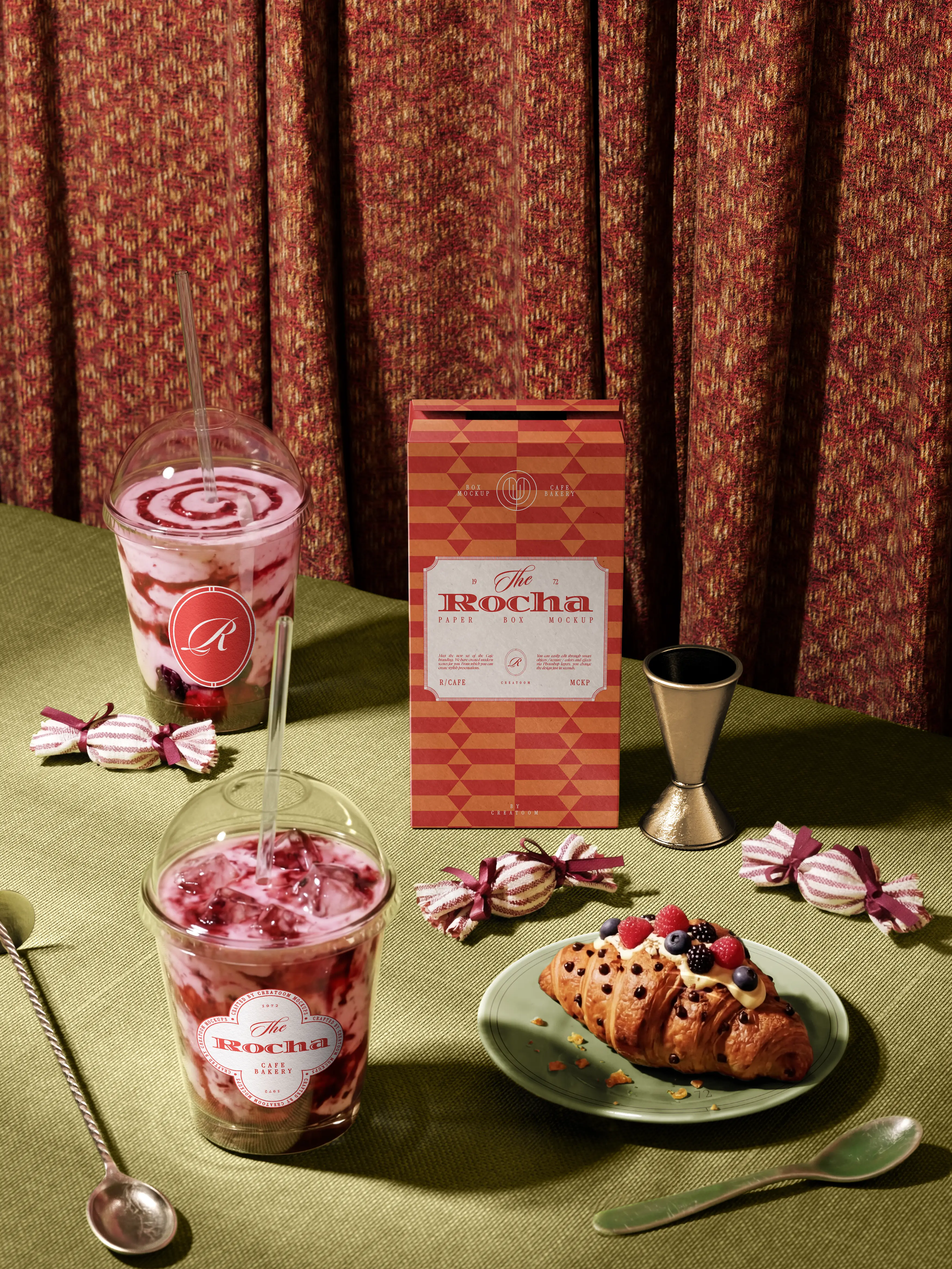
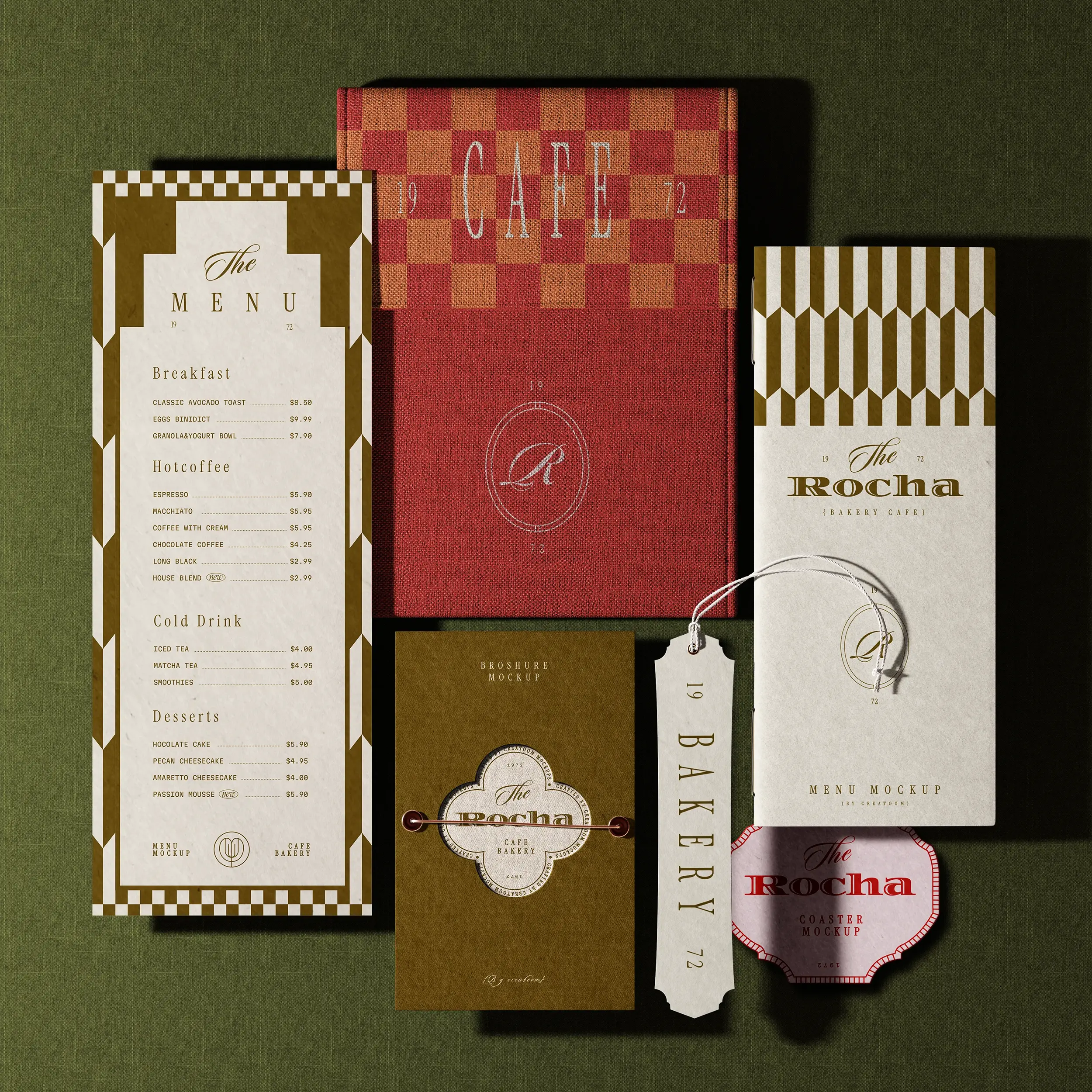
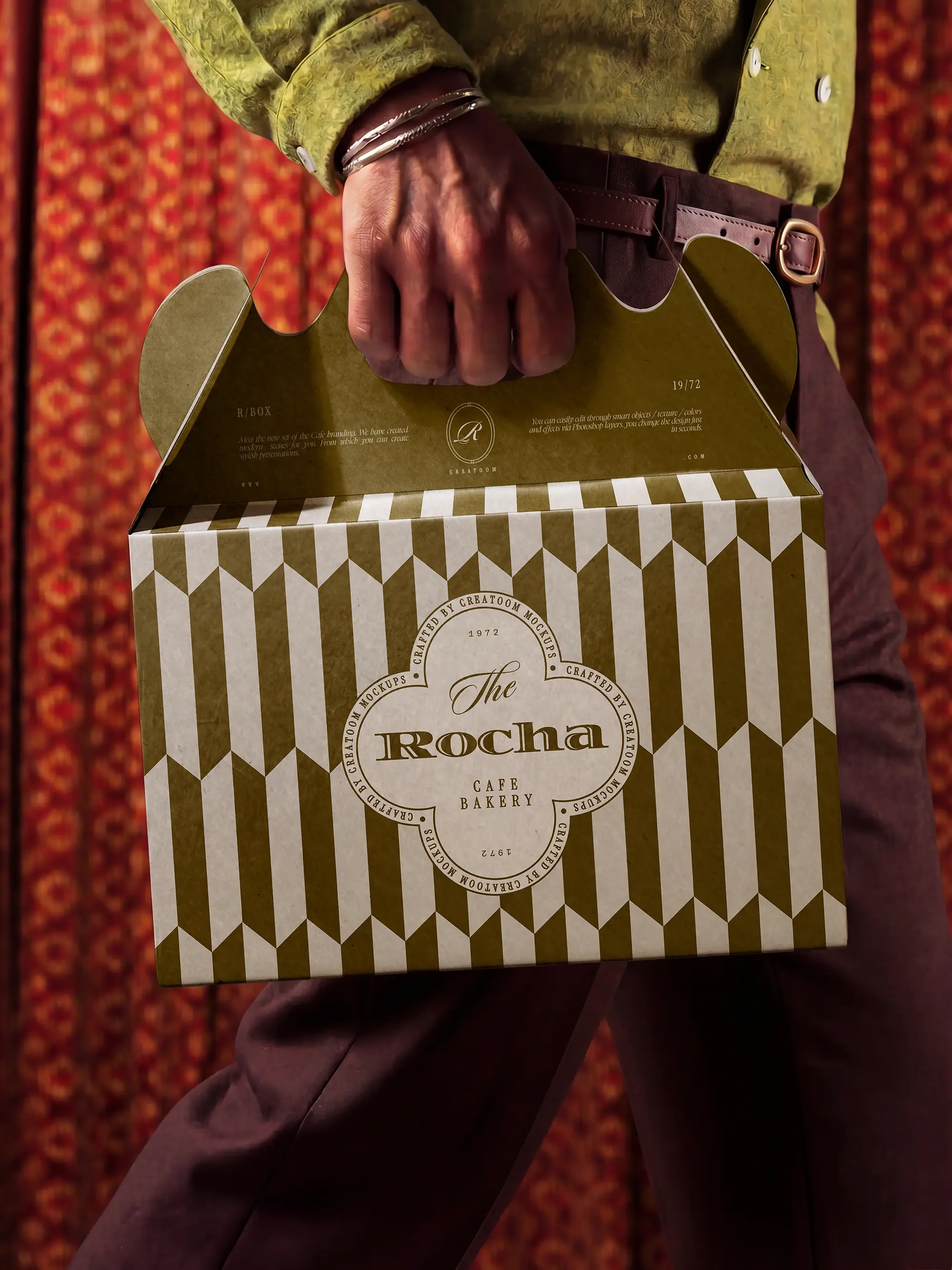
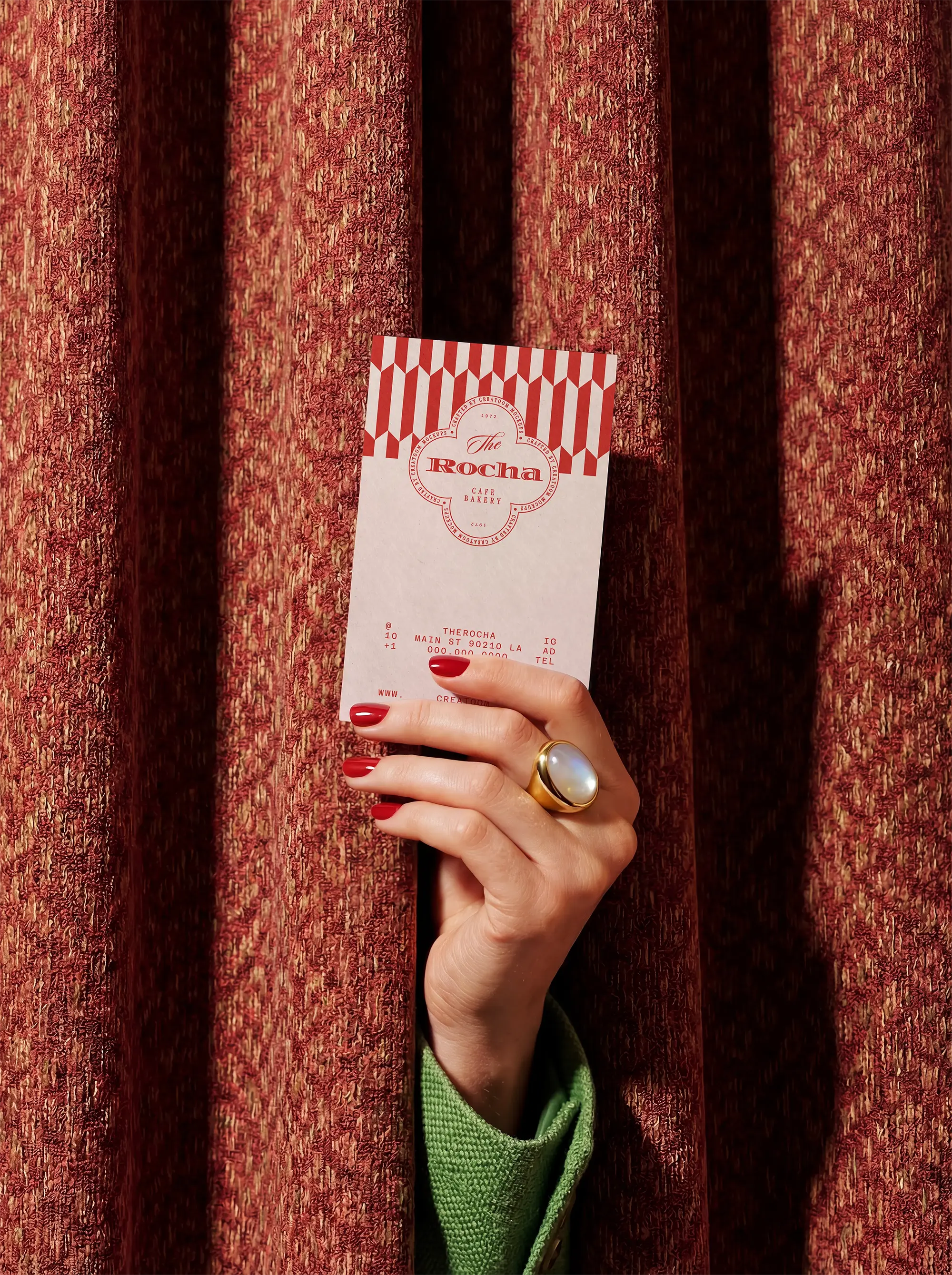
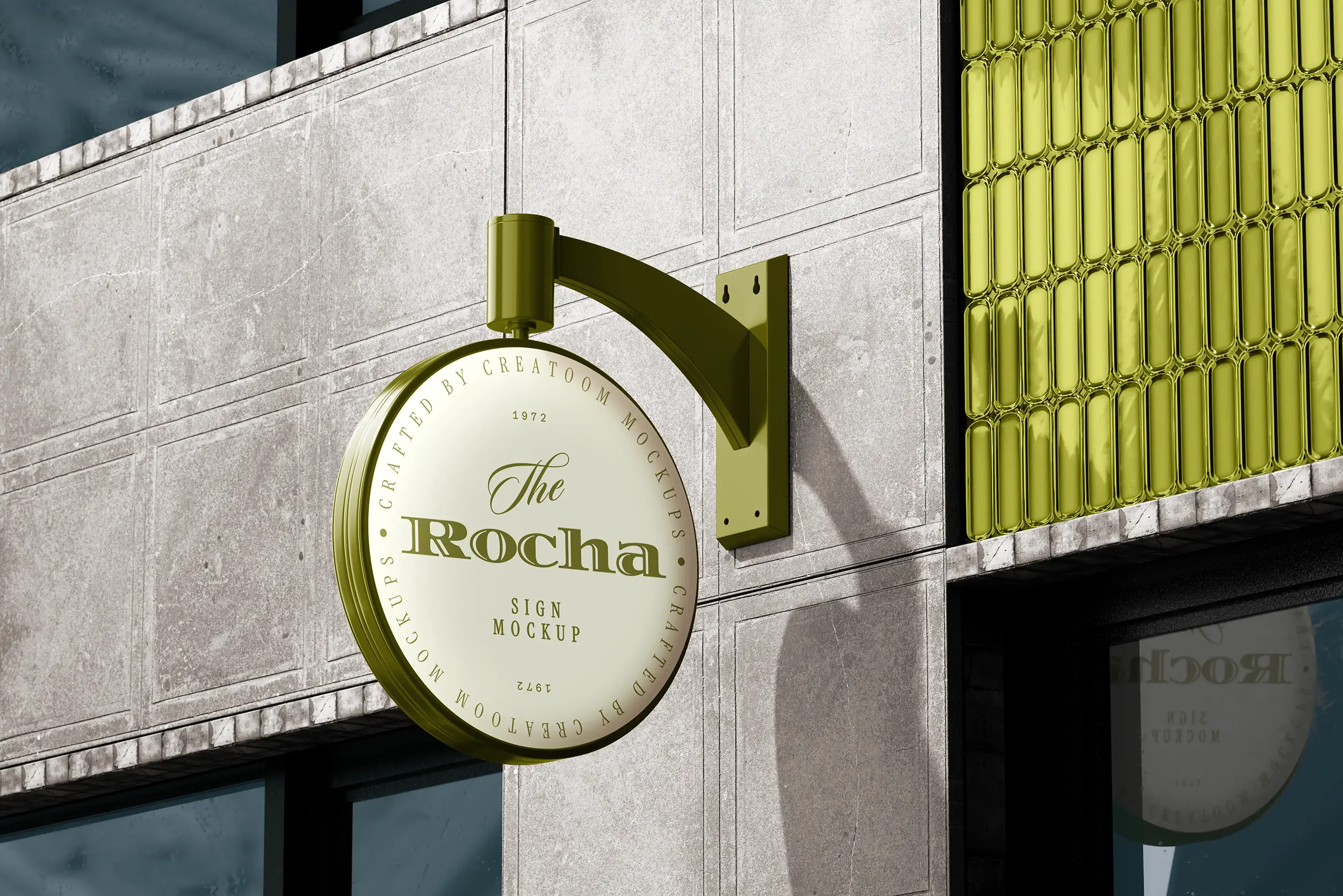
The Rocha is a neighbourhood bakery café that bakes through the night and sells out by noon. We gave it an identity built on its arched shopfront: a scalloped seal, a red-and-olive palette, and packaging that carries the arch onto every box, cup and menu.
The Challenge
The bakery’s food had a following, but its look was a patchwork of stock labels and a hand-painted sign. Regulars knew the name; nobody recognised a Rocha box outside the shop.
The Solution
We drew the wordmark from the lettering on the original awning and set it inside a scalloped seal that works at stamp size. The arch of the shop window became a repeat pattern for boxes, bags and the cup sleeve.
Colours come straight from the counter: tomato red for pastry boxes, olive green for drinks, cream for everything printed in-house.
Key Highlights
One seal that works from a business card to the shop sign
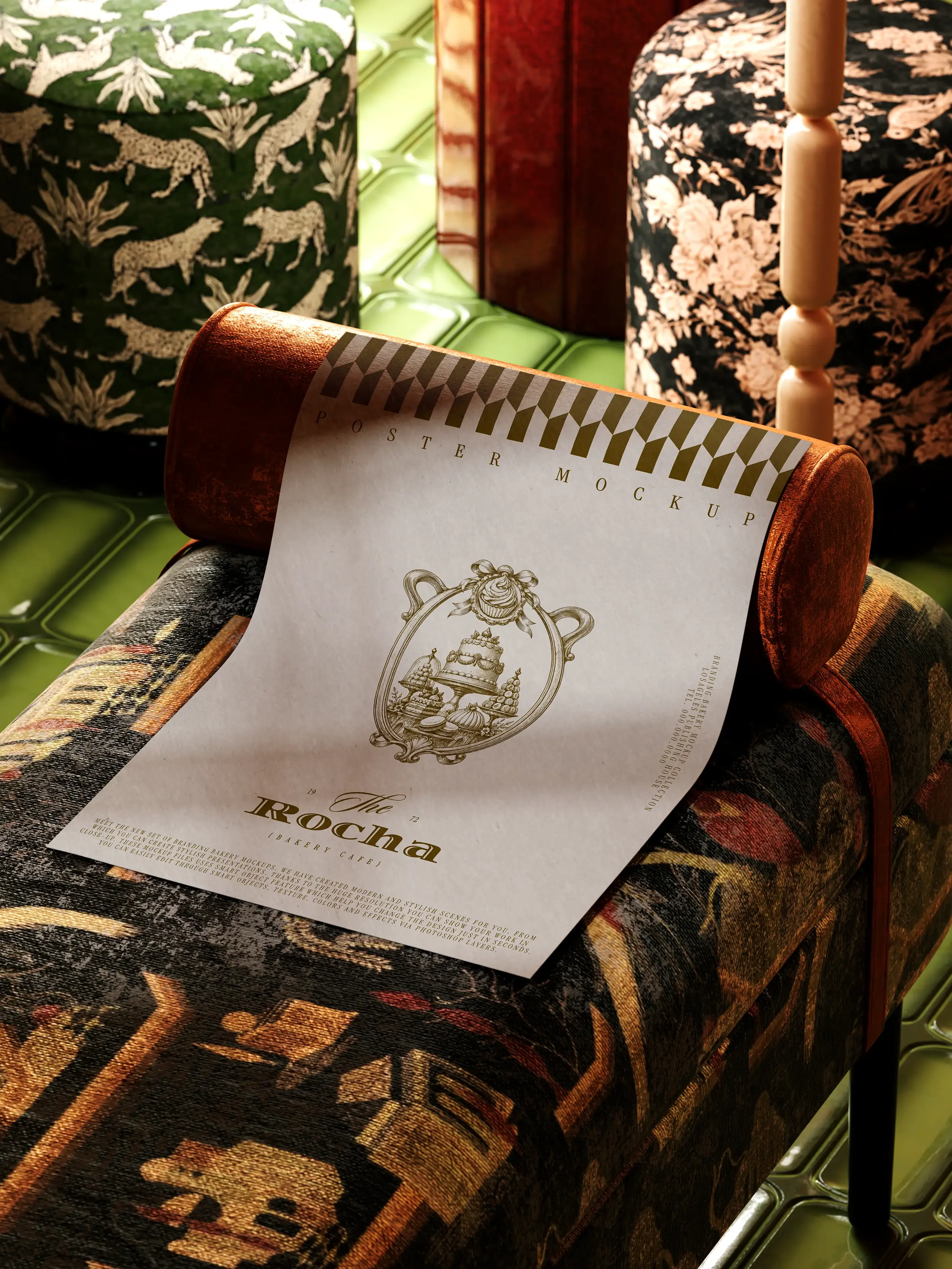
Box, cup, menu and poster system printed in two colours
A pattern library for seasonal specials