Visual Identity
Packaging Design
Art Direction
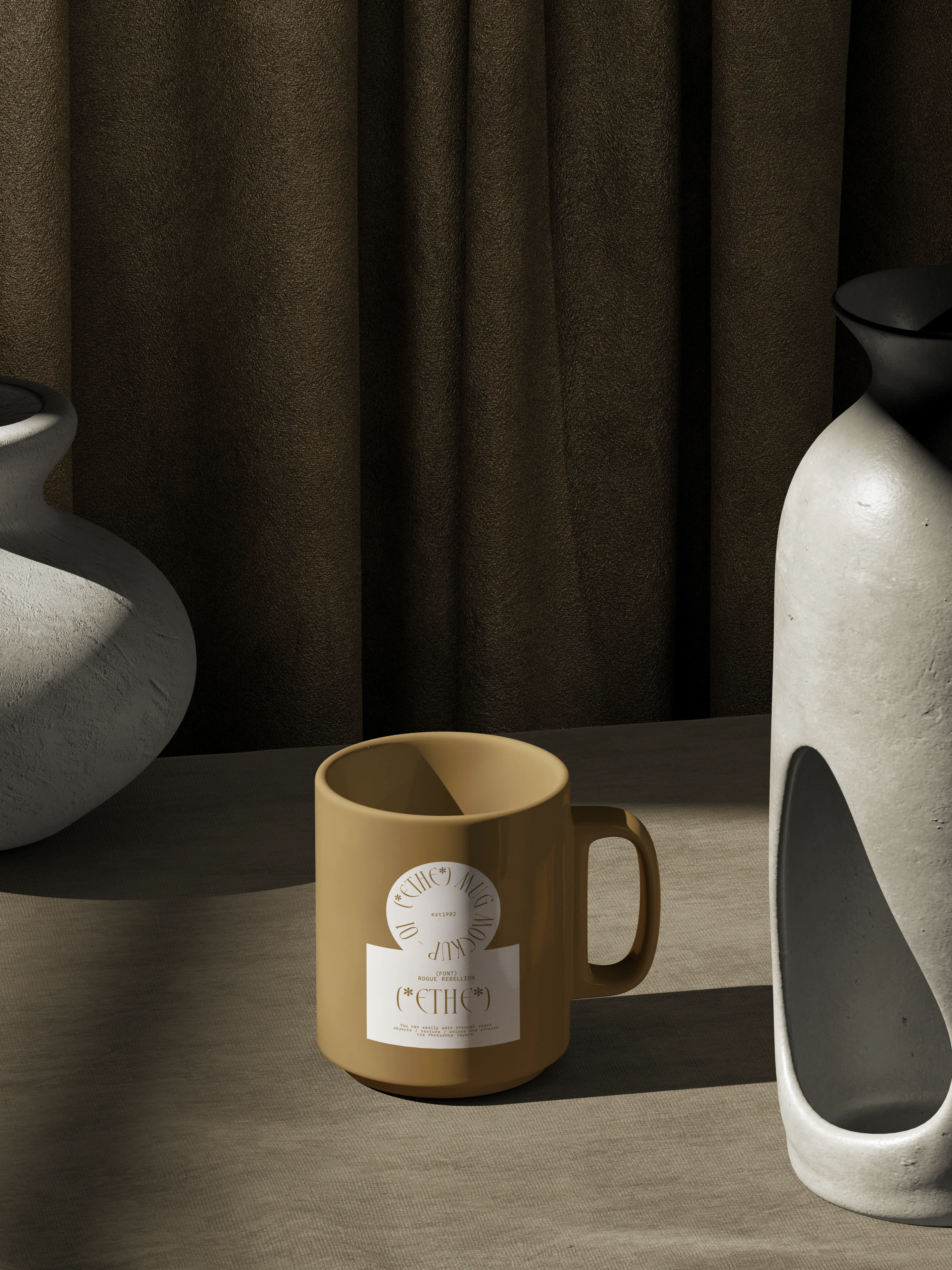
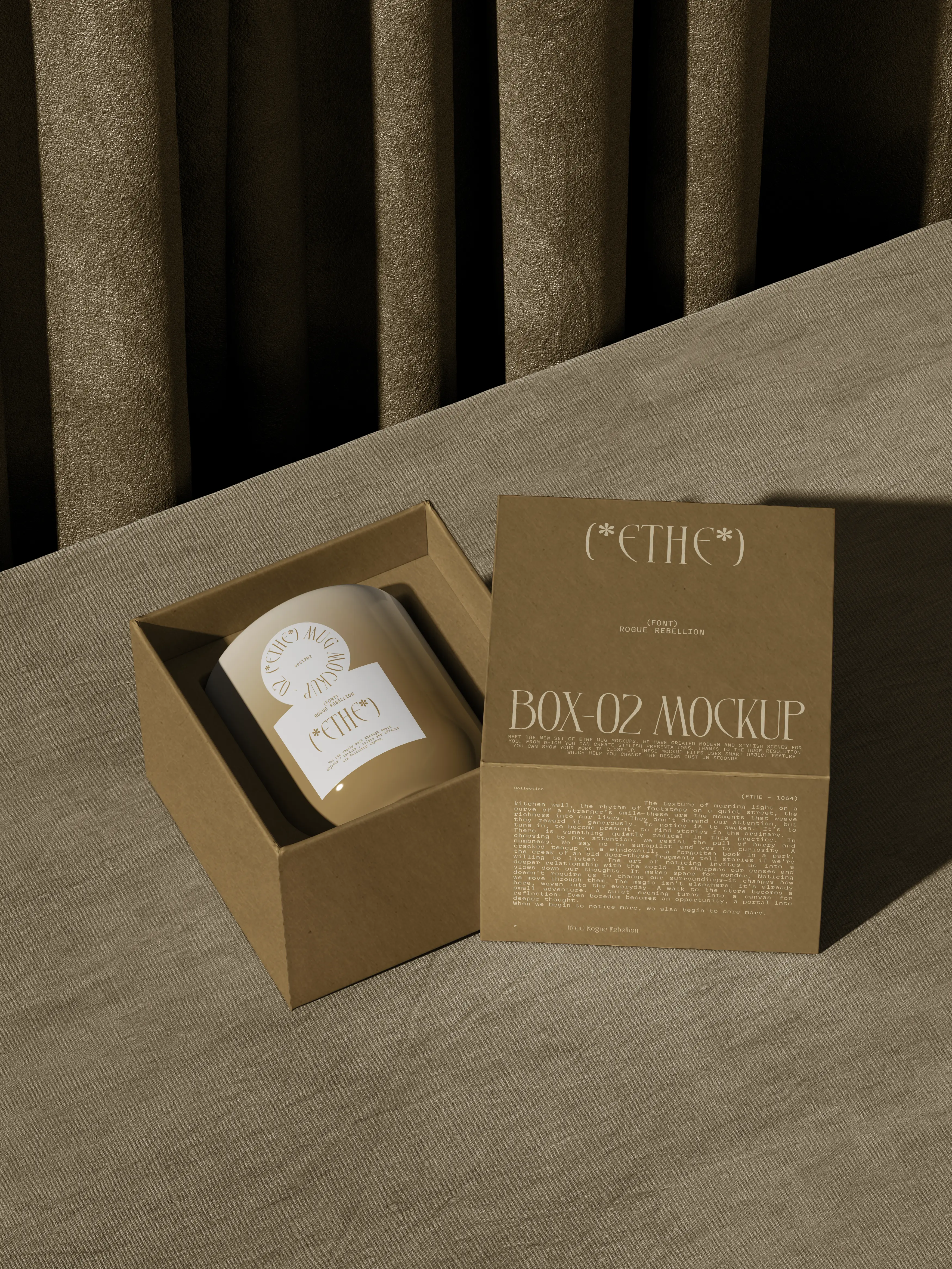
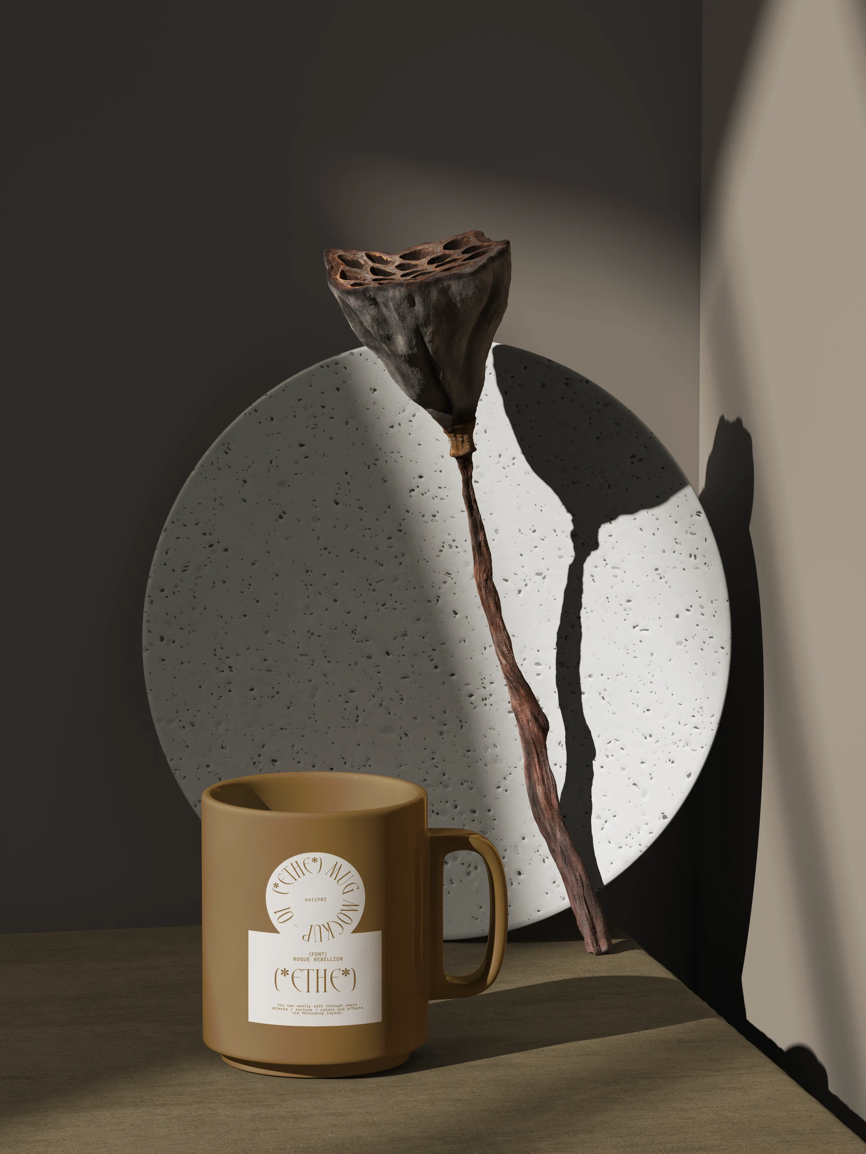
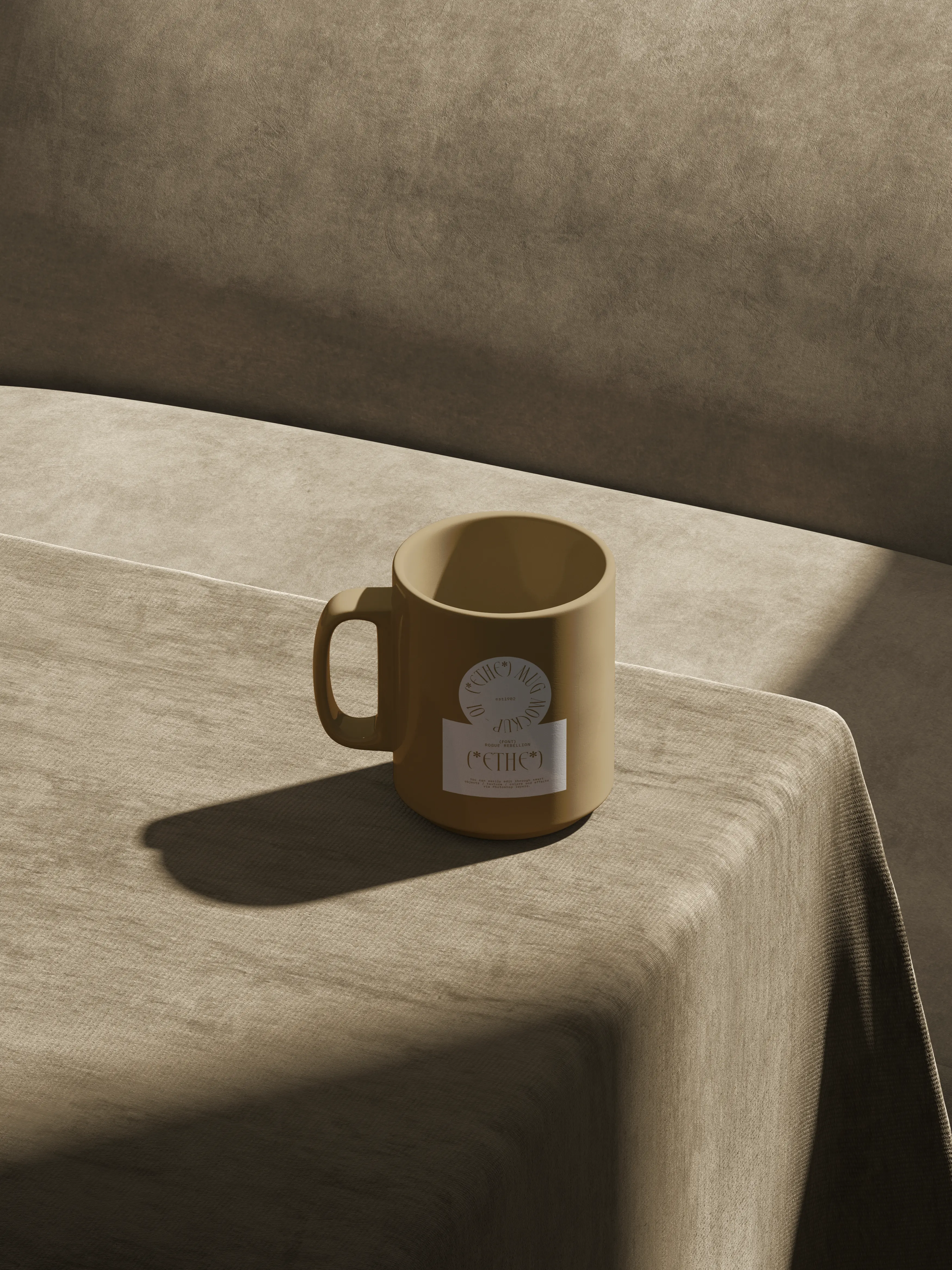
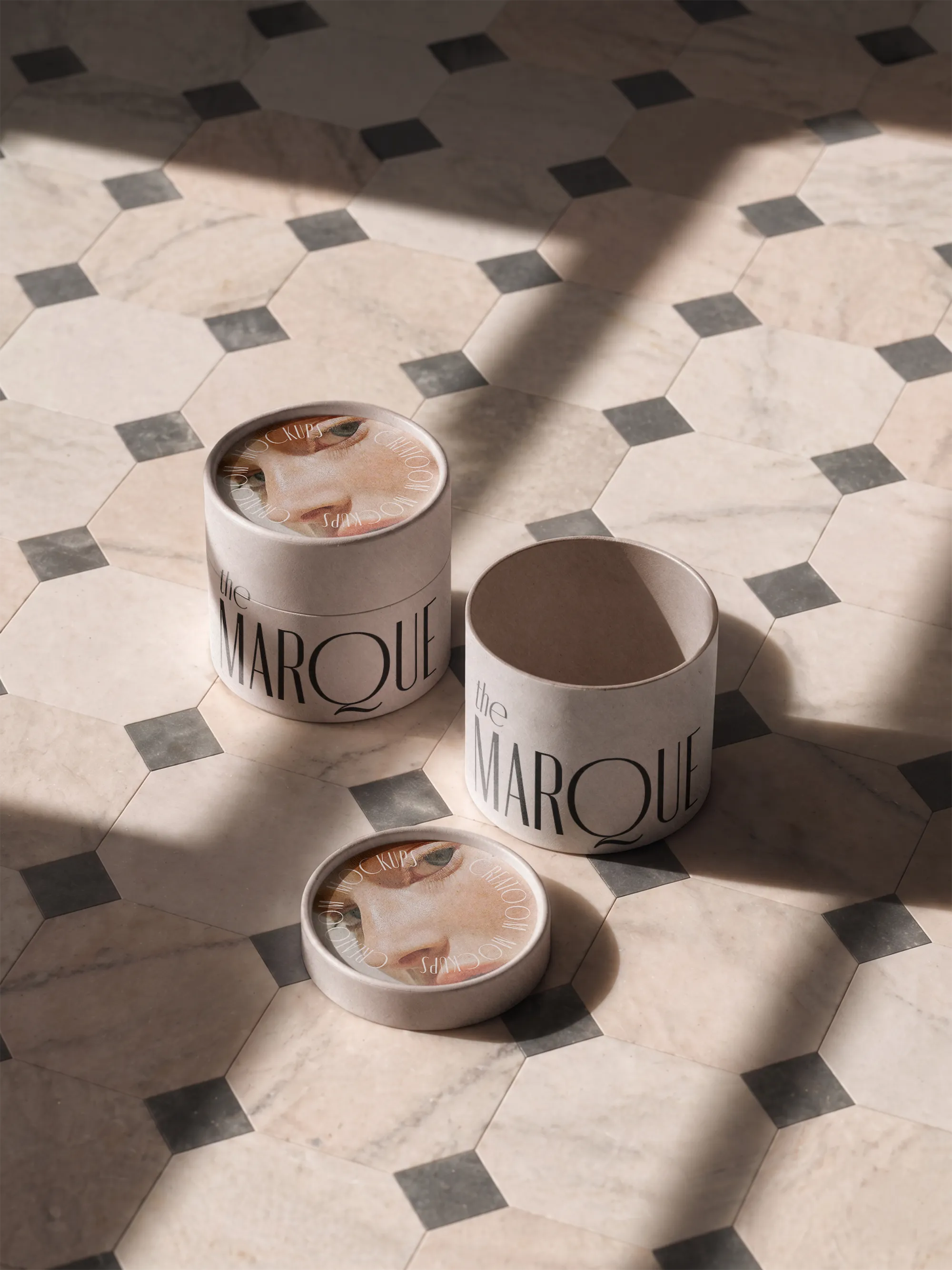
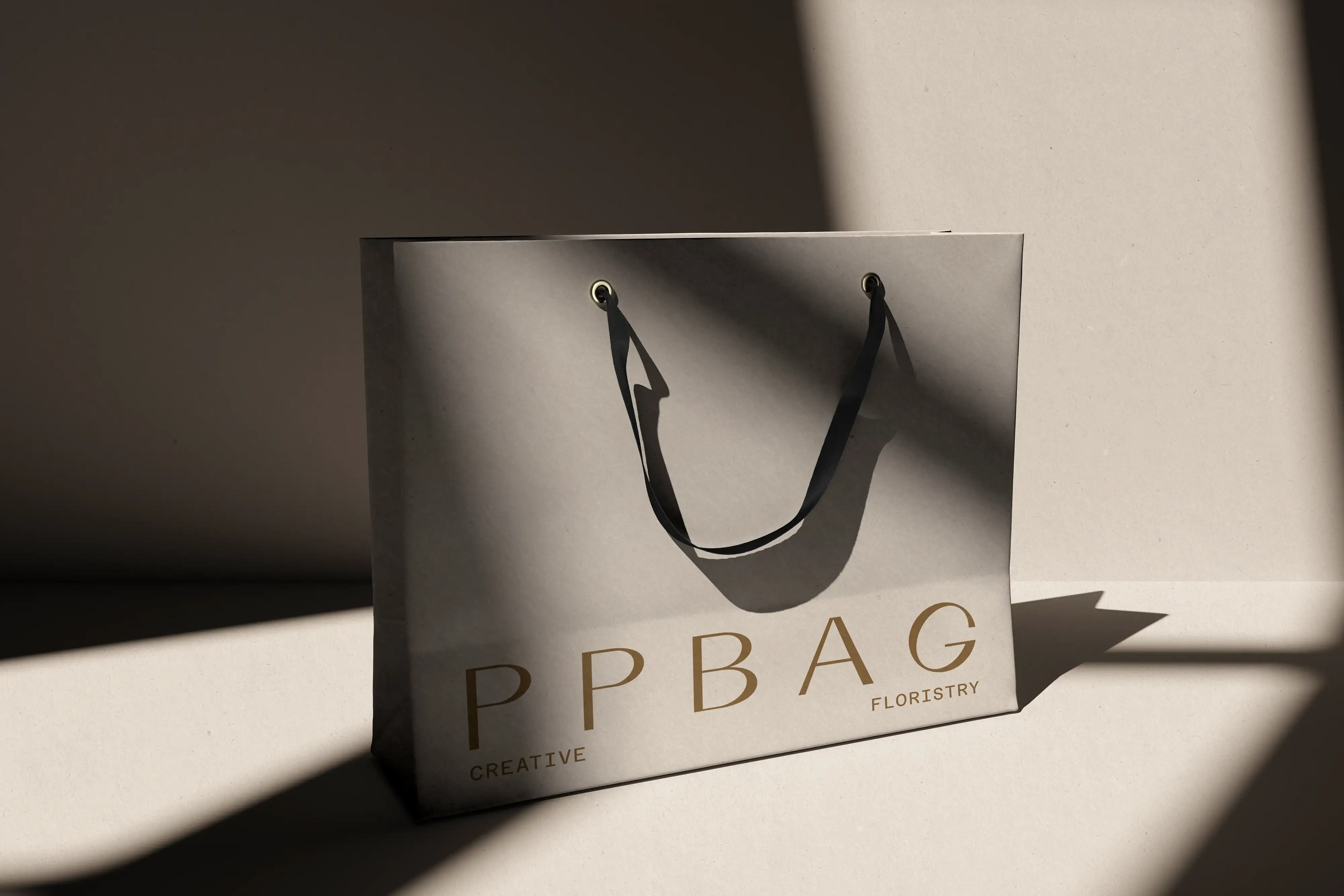
Ethe makes stoneware mugs in small batches. We designed a round paper label that sits on the mug itself, a kraft gift box that echoes it, and the art direction for product shots in low, warm light.

The Challenge
Ethe sells mostly online, where a handmade mug looks like any other mug. The studio needed a mark that shows up in a thumbnail and survives on a glazed curve.
The Solution
The brand mark is a circle: the wordmark set in parentheses inside a round label, sized to sit flat on the mug’s belly. The same circle is printed on the kraft box lid, so box and mug match when unwrapped.
For photography we kept to one set of props, linen and a single light source, so every glaze reads true on the shop page.
Key Highlights
Label shaped to fit a curved surface
Kraft gift box printed in one ink
A photography guide for every new glaze