Brand Strategy
Packaging Design
Art Direction
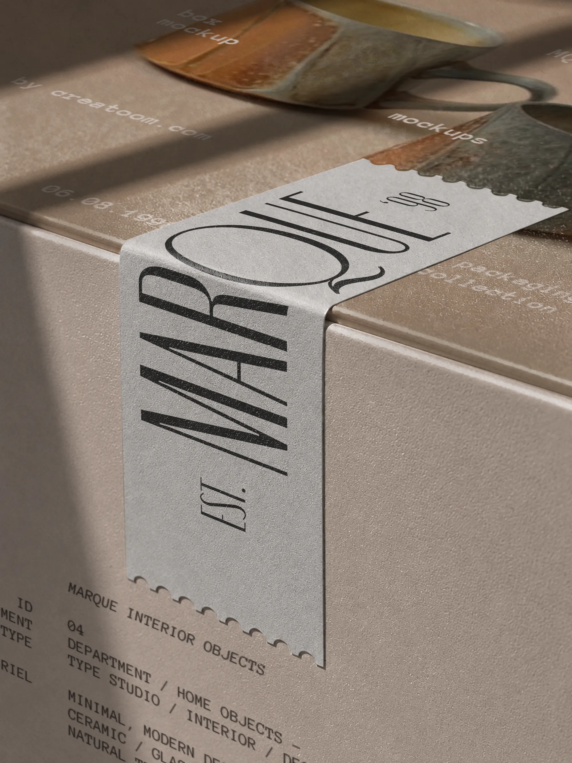
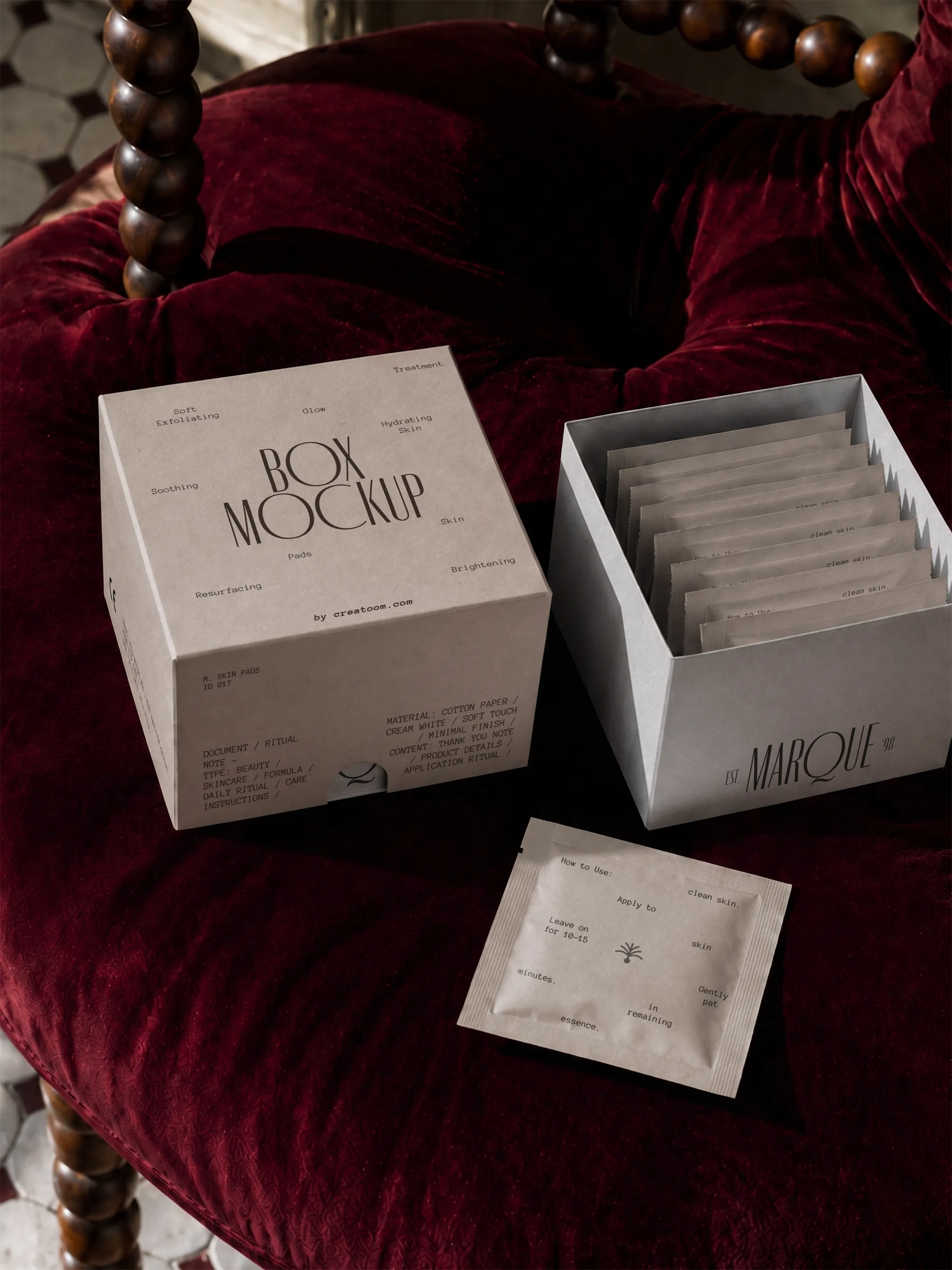
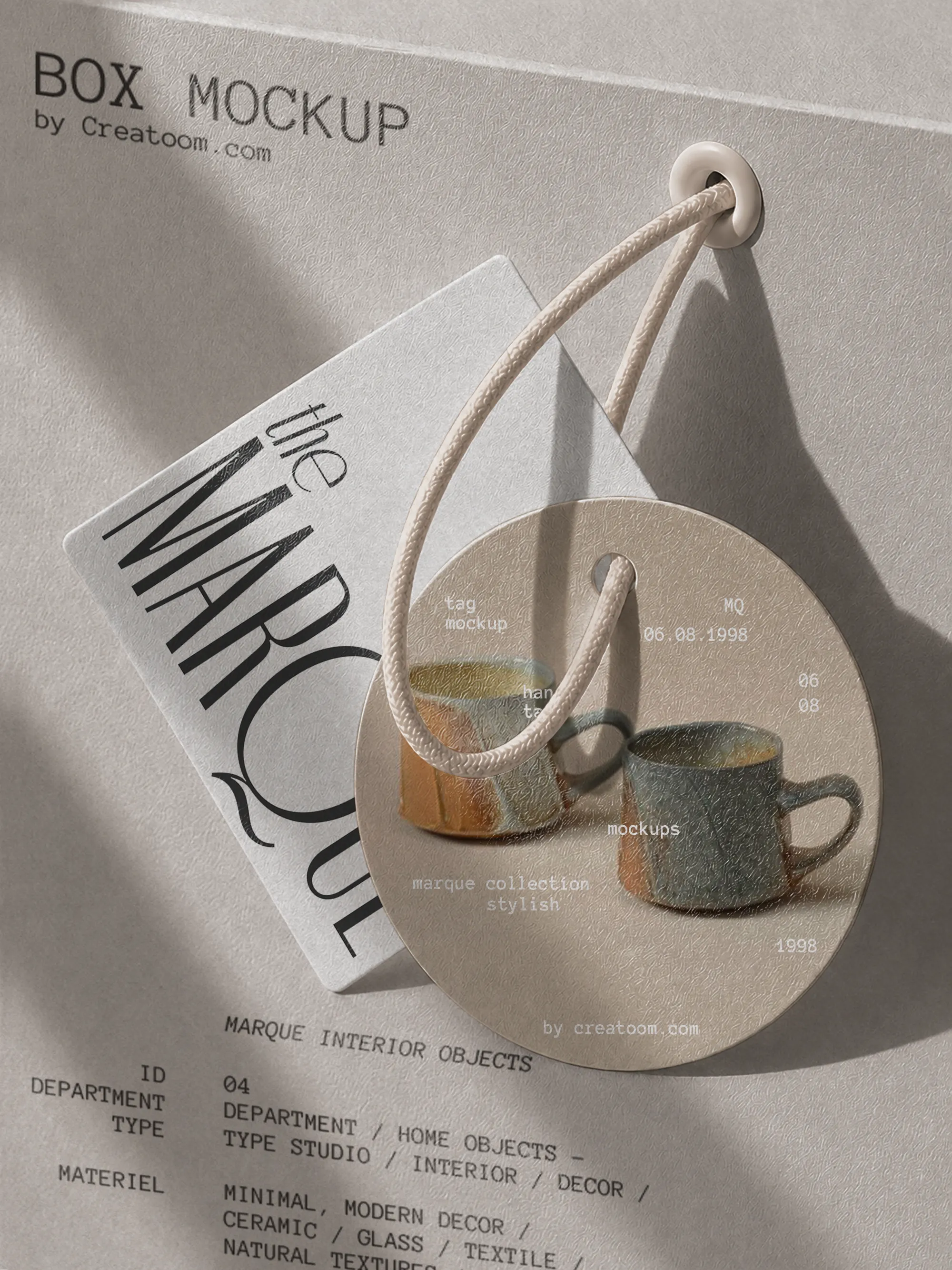
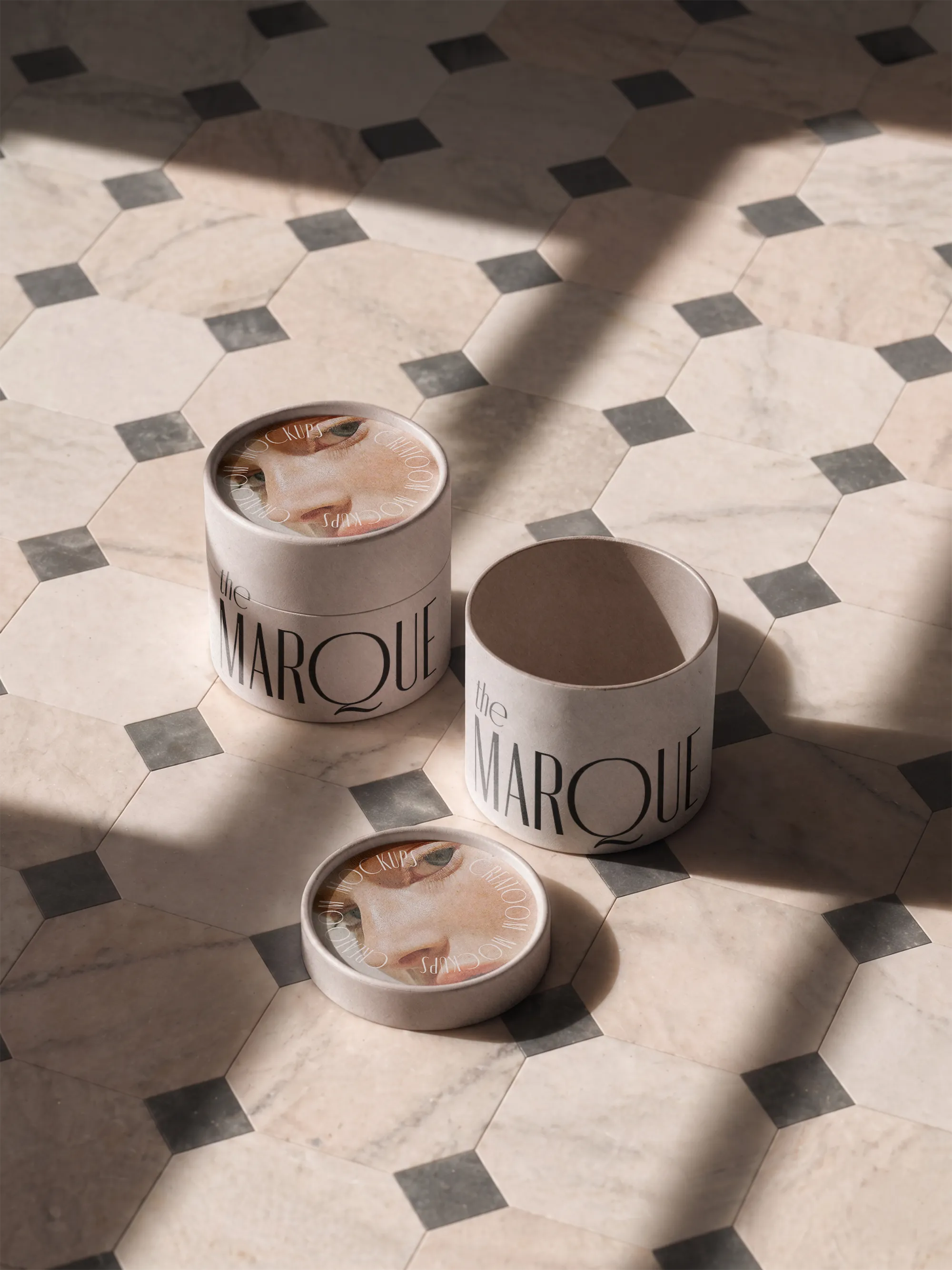
Marque sells ceramics and home objects from a tiled studio. We built its packaging around a tall editorial serif and printed portraits, so seals, tubes, envelopes and tags read like pages from the same magazine.
The Challenge
Marque’s range grew from two vases to forty objects, each shipped in whatever box fitted. Customers loved the pieces but couldn’t tell a Marque parcel from any other.
The Solution
We set one rule for every pack: the wordmark climbs the side vertically, each object’s details are typed in full like a museum label, and a hand-drawn portrait marks each collection.
Seal strips, tubes, envelopes and hang tags share the same off-white stock, so a small order and a full set arrive looking related.
Key Highlights
One packaging rule for forty objects
Vertical wordmark that still reads when boxes are stacked
A portrait illustration for each collection